


vibeSSENTIALS:
Translating Sound into Space
Brand Designer, Art Director
2025
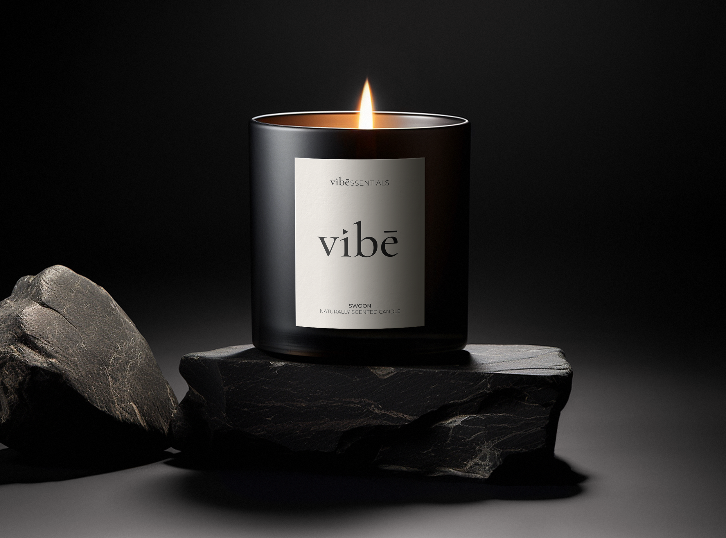
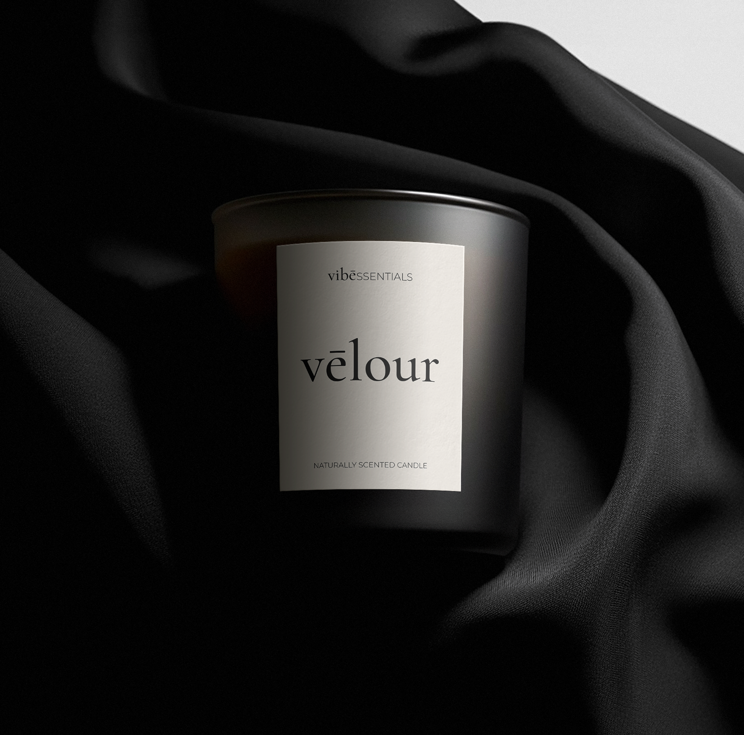
Jay Glavany is a musician and creative force and vibeSSENTIALS is his sensory product line: candles, fragrances, and objects designed to shape the atmosphere in which music is felt. The core design challenge was to hold two distinct but inseparable identities in one mark: "vibe" (expressive, sonic, cultural) and "essentials" (refined, considered, purposeful). Jay is not only creating music but he is curating the entire environment in which that music exists.
-
Balance two opposing brand forces: artistic expression and curated luxury in a single visual identity that doesn't flatten either one.
-
Resolve the tension typographically. Two typefaces, two weights, two tempos, unified in one mark. Custom details embedded with musical and editorial meaning.
-
A logo that reads as proprietary and bespoke; an art object as much as a brand mark. The identity positions the brand as culture, not commerce.
-
The identity is in active use across packaging, built as a system ready to extend across new product lines, with a clear art-forward positioning established from the ground up.
Process
THE MARK
The logo as a wordmark and a score.
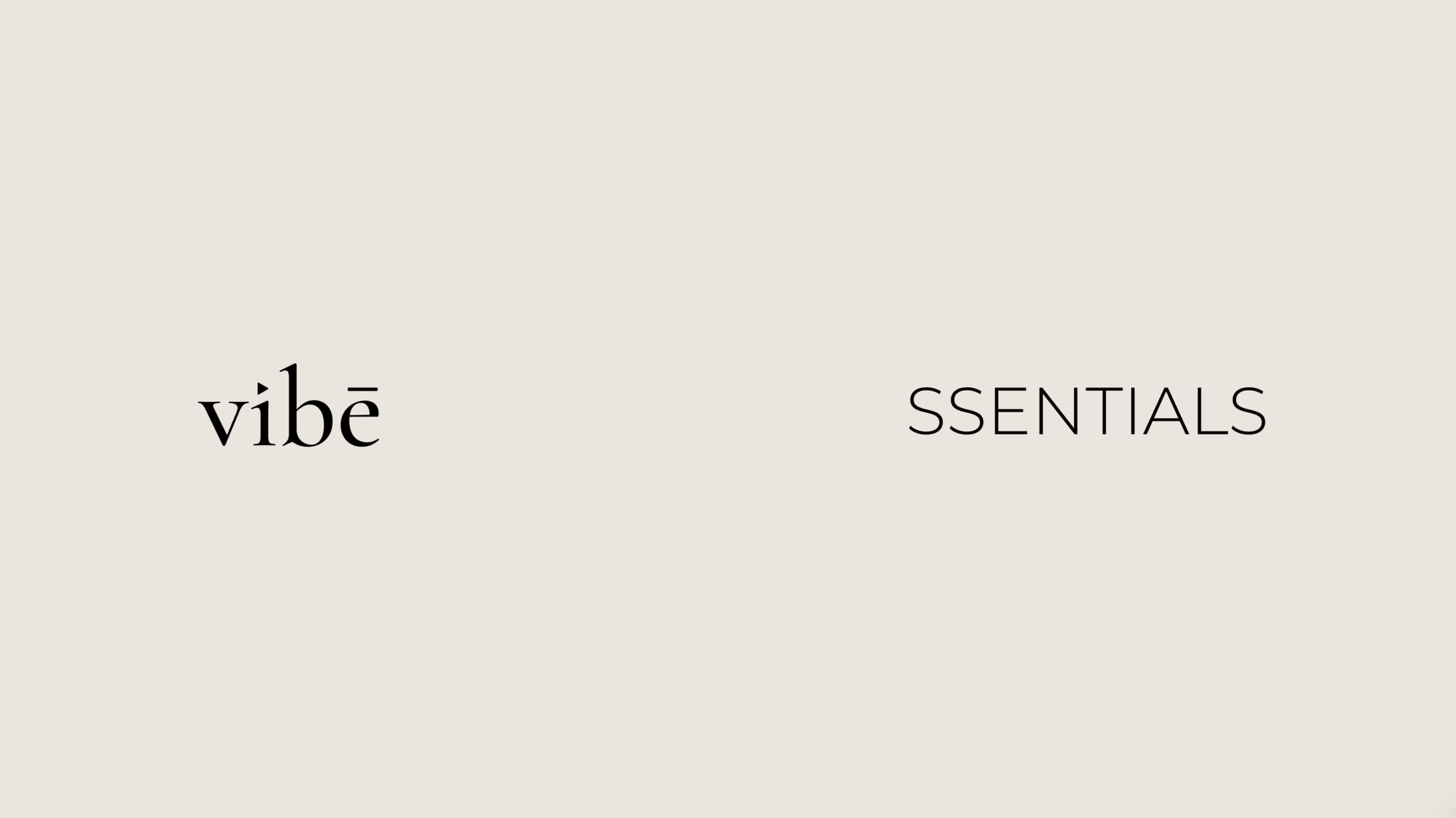
The selected serif carries elongated forms and sculptural finesse; the kind of letterform you find in magazine mastheads or poetry anthologies, not always product labels. That elevation is intentional: vibeSSENTIALS is an artform first, product second.
Triangle over the "i" — a directional symbol suggesting play, upward movement, and creative energy. Nods to Jay's musical roots while reinforcing forward motion.
Macron over the "e" — adds a sense of bespoke intention. The mark feels collectible rather than commercial.
Rhythmic Stroke Contrast — the interplay between thick and thin strokes mirrors the dynamics of sound itself: quiet builds and dramatic peaks.