vibeSSENTIALS: Translating Sound into Space
BRAND DESIGN, ART DIRECTION
Design Intent
The core challenge of the identity was to balance two distinct but inseparable forces within the brand: vibe and essentials. On one hand, Jay Glavany is a musician and creative force; on the other, he is a tastemaker and curator of experience. vibeSSENTIALS exists at that intersection—where sound meets space, and mood becomes material.
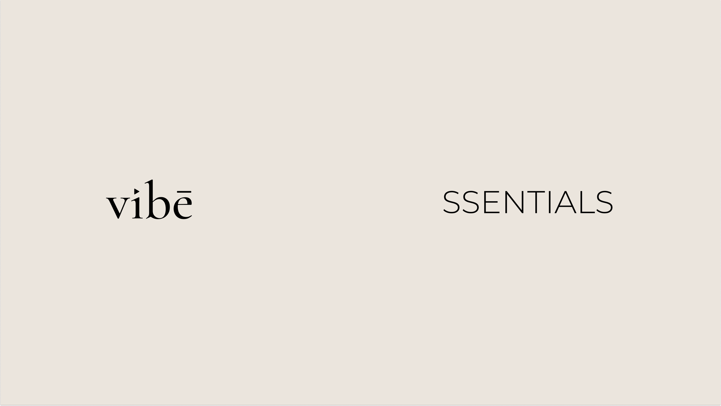
The logo was designed to visually express this duality through typographic contrast:
A refined elegant serif form anchors the brand in craftsmanship, permanence, and editorial luxury.
Subtle modern detailing keeps it contemporary and culturally tuned.
This dual-type approach mirrors the brand’s philosophy: artistry grounded in ritual, expression grounded in utility. Jay is not only creating music—he is curating the entire environment in which that music exists.
Typographic Strategy & Symbolism
The selected serif typeface features elongated forms and sculptural finesse reminiscent of magazine mastheads or poetry anthologies. It positions vibeSSENTIALS as an artform first, product second, evoking luxury without feeling distant or untouchable.
Custom typographic details introduce musical meaning into the mark:
Triangle over the “i”
Functions as a directional symbol—suggesting play, upward movement, and creative energy. It nods directly to Jay’s musical roots while reinforcing forward motion and momentum.Macron over the “e”
Adds a sense of intention and refinement, making the logo feel bespoke and collectible rather than commercial.Rhythmic Stroke Contrast
The interplay between thick and thin strokes mirrors the dynamics of sound itself—quiet builds and dramatic peaks. The mark becomes a visual echo of Glavany’s sonic language.
Together, these details create a logo that feels proprietary, expressive, and rhythmically alive—a distinctive signature for a brand built on atmosphere.
Outcome
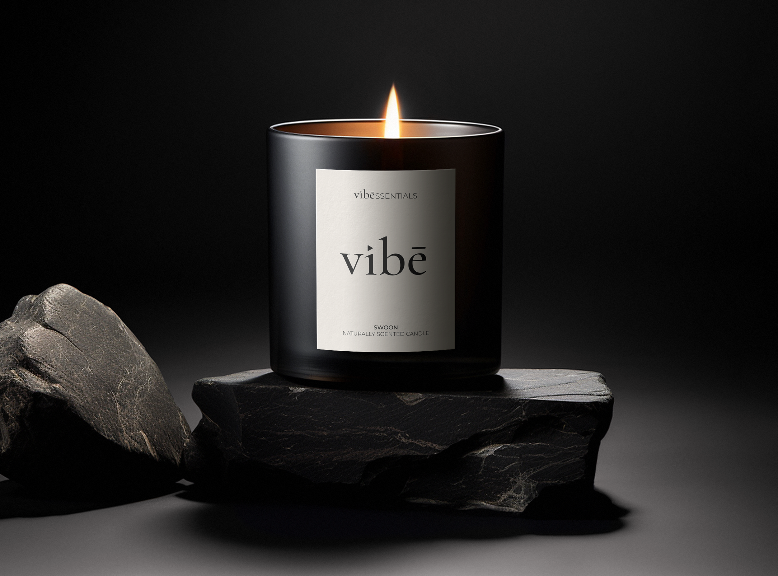
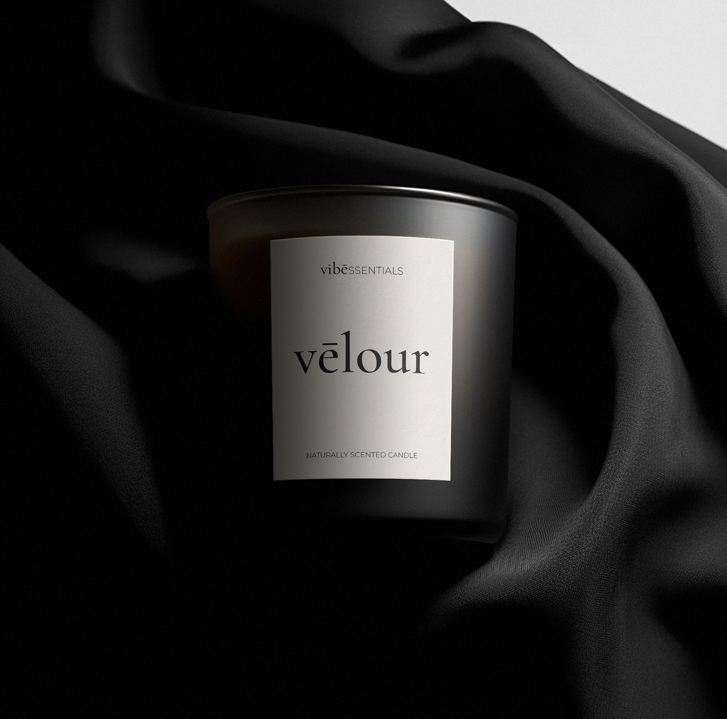
The final identity positions vibeSSENTIALS as a brand that lives between music, design, and sensory experience. The logo communicates that this is not simply a candle or fragrance line—it is an extension of an artist’s world, designed to shape how sound is felt in space.
Through custom typography, nuanced symbolism, and refined restraint, the identity balances vibe and essentials with intention—where brand duality meets typographic duality.