

Elevating Identity: Rebranding The Reisman Awards
BRAND DESIGN
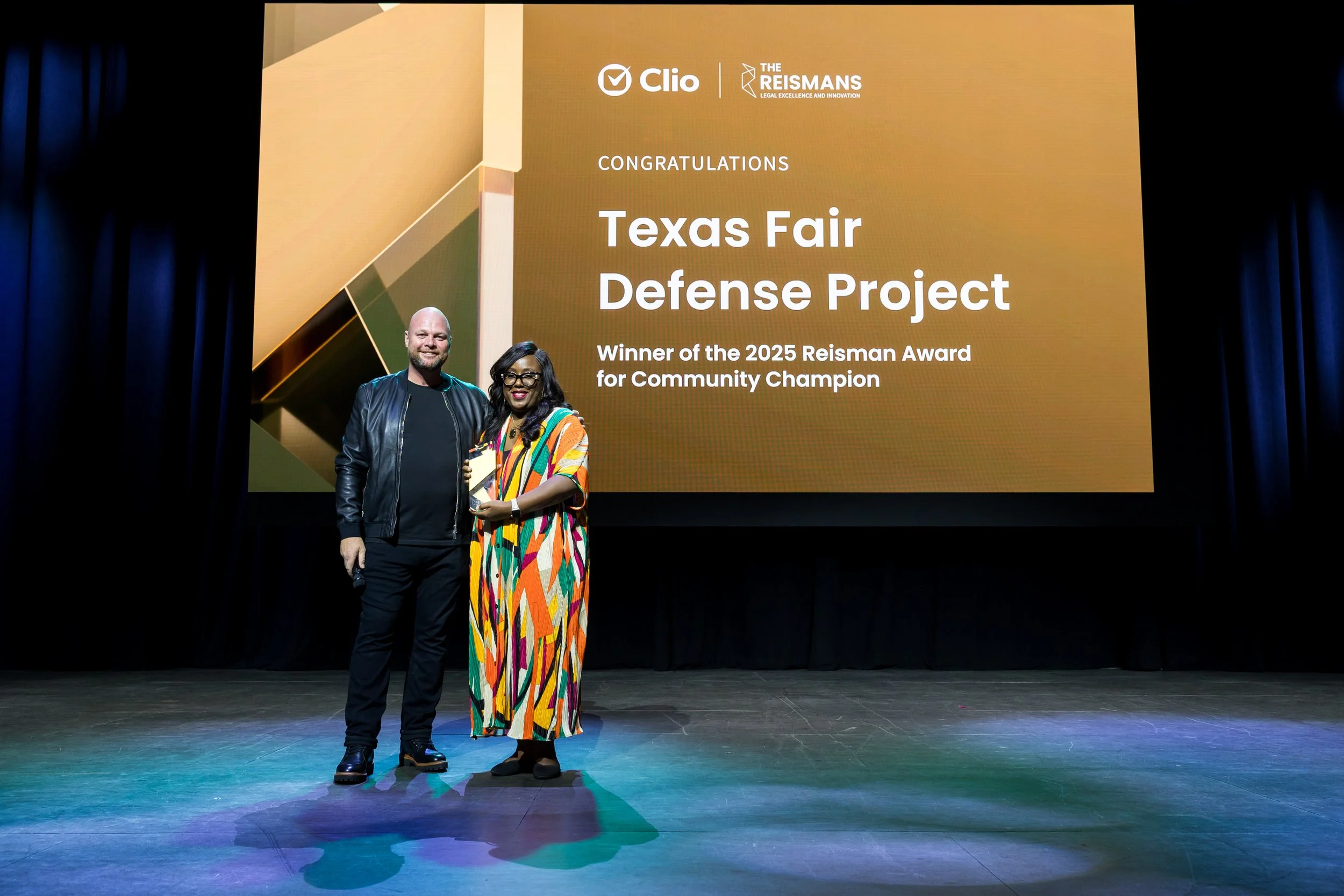
The Reisman Awards are Clio’s annual recognition program celebrating law firms and legal professionals who demonstrate excellence, innovation, and dedication to client service. The awards highlight outstanding achievements across categories such as legal innovation, community impact, and growth, shining a spotlight on those driving meaningful change in the practice of law. Winners receive recognition through digital promotion, events, and branded assets, reinforcing the program’s prestige and industry impact.
PROBLEM
The Reisman Awards lacked a distinct, elevated identity—its visuals were generic, inconsistent, and failed to convey the prestige of an award meant to celebrate true industry trailblazers. As a result, the program didn’t “look the part,” and the experience felt more routine than remarkable.
SOLUTION
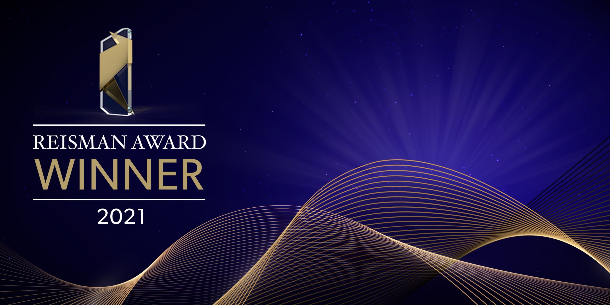
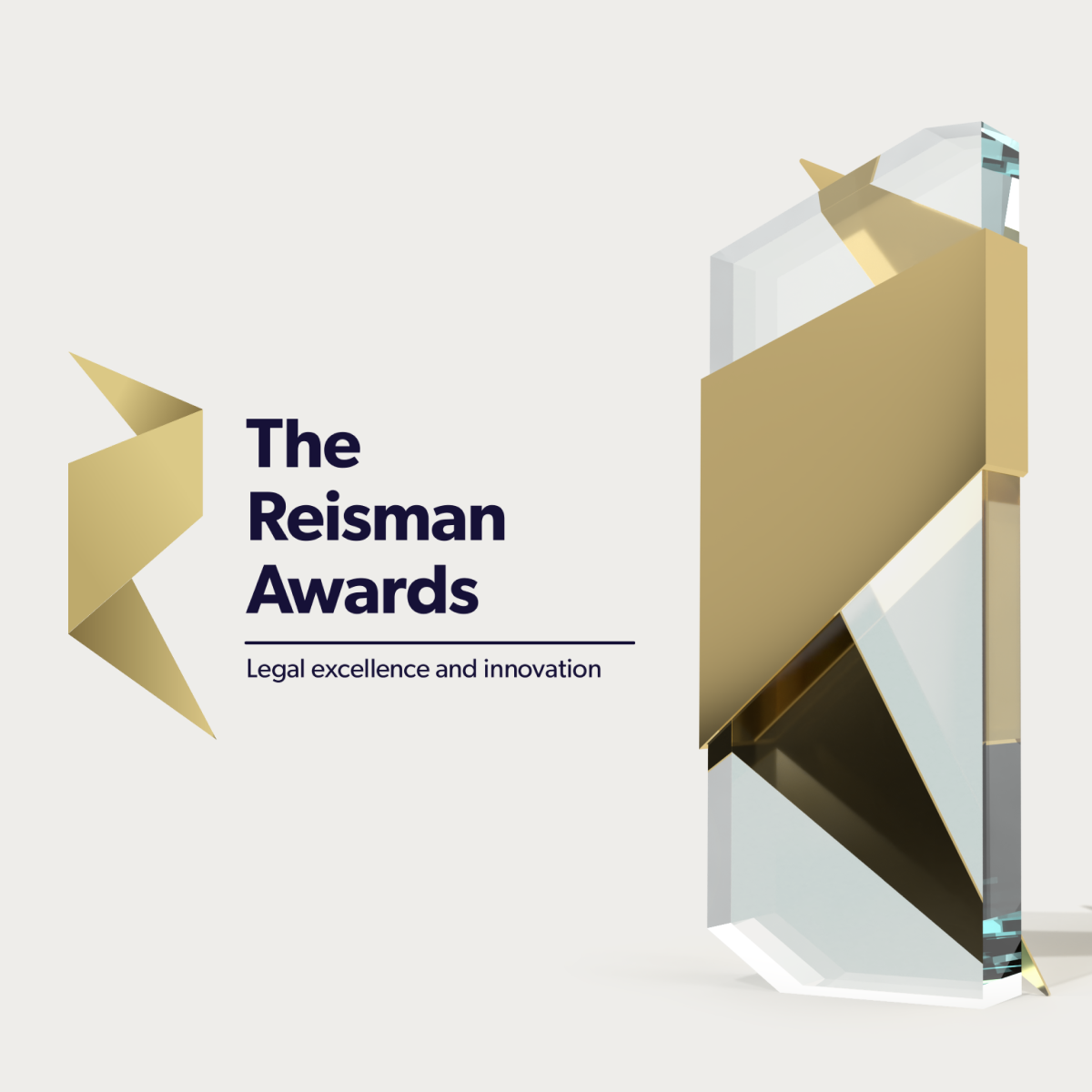
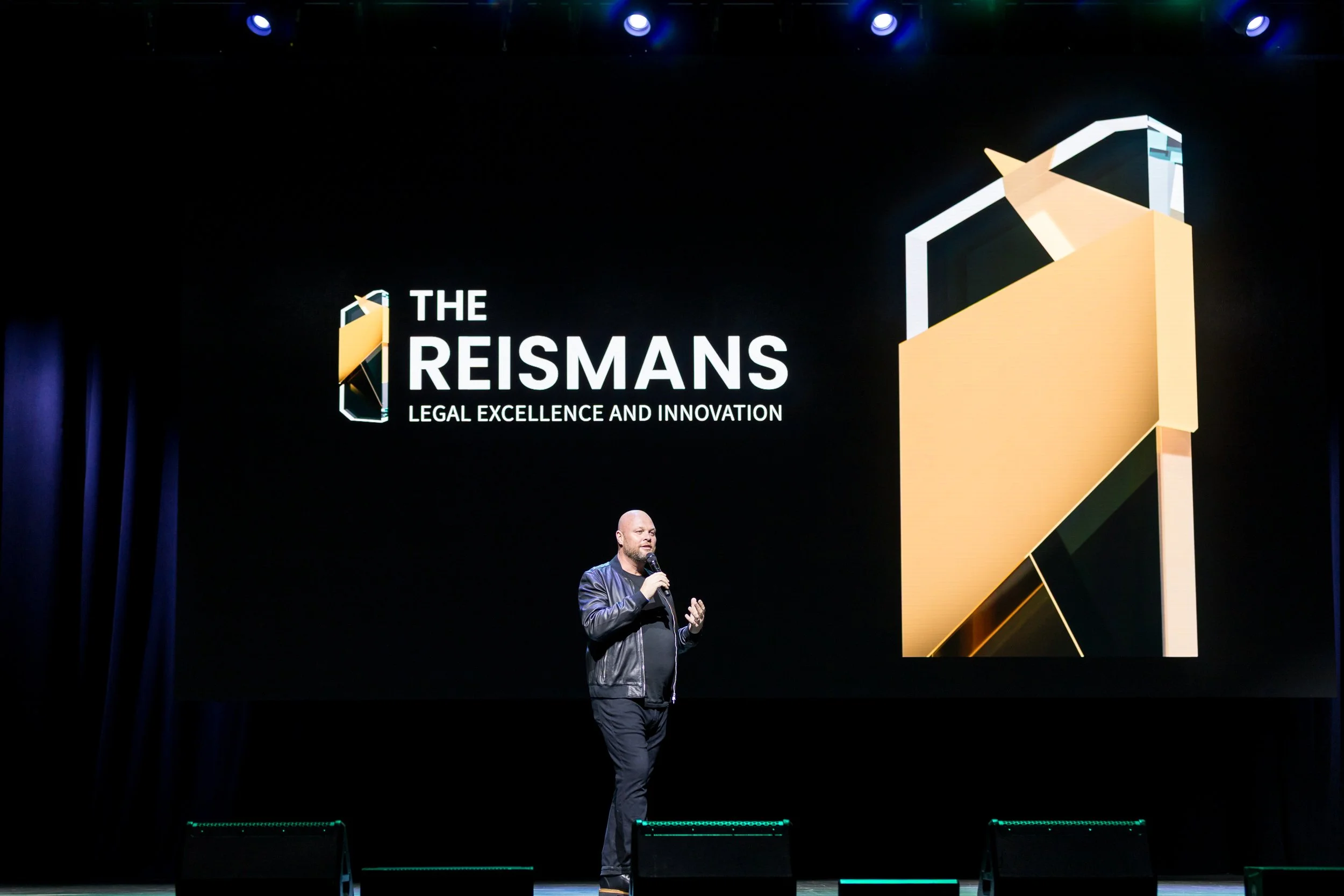
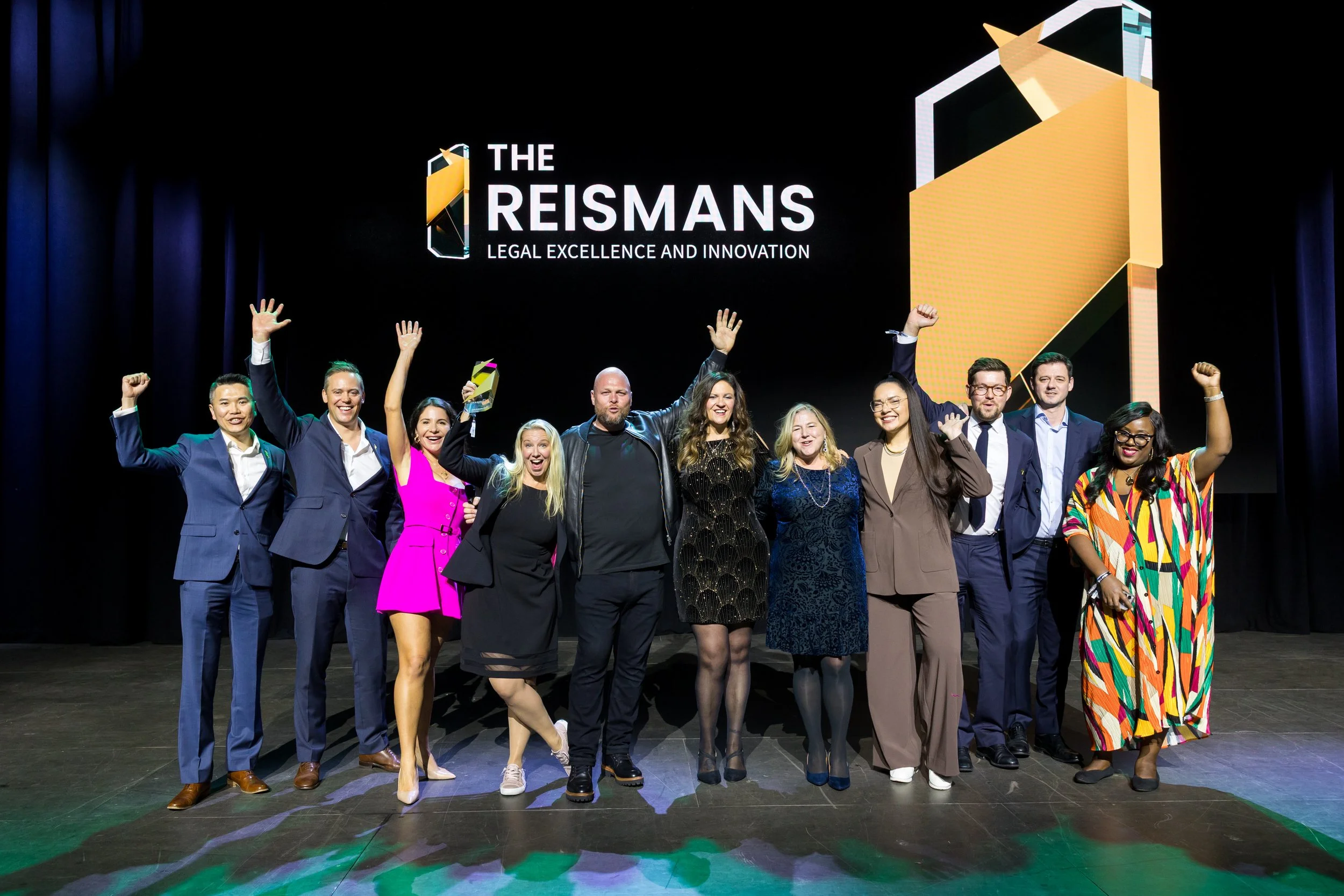
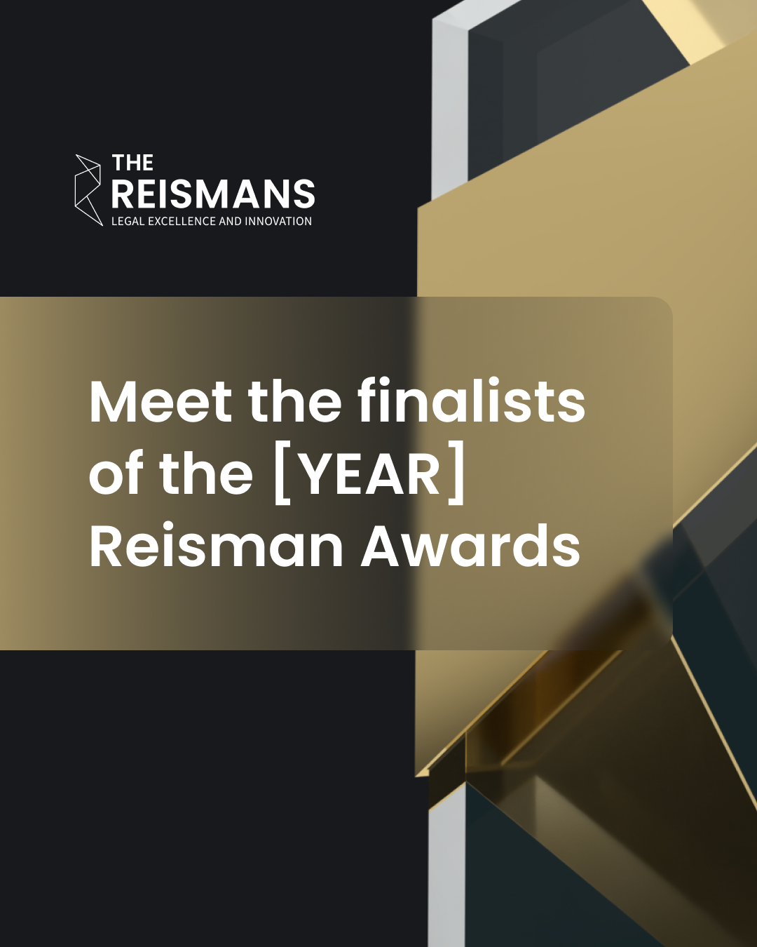
I rebranded the program with a distinct, elevated visual identity—introducing darker backgrounds, liquid-glass textures, and positioning the trophy at the center of the system to reinforce prestige. I expanded the palette with three bold, high-contrast colours, including gold, to energize the brand while staying aligned with Clio’s core visual language.
RESULT
After the rebrand, submissions to the program increased, driven by clearer differentiation and a stronger visual presence. Engagement with the awards page rose noticeably, and the entire experience felt more premium, cohesive, and aligned across every touchpoint.
OUTCOME
The refreshed identity elevated the awards’ credibility and recognition within the industry, shifting perception toward a more prestigious, highly regarded program. More firms saw the awards as meaningful and worth entering, and the rebrand strengthened Clio’s broader brand ecosystem and storytelling.
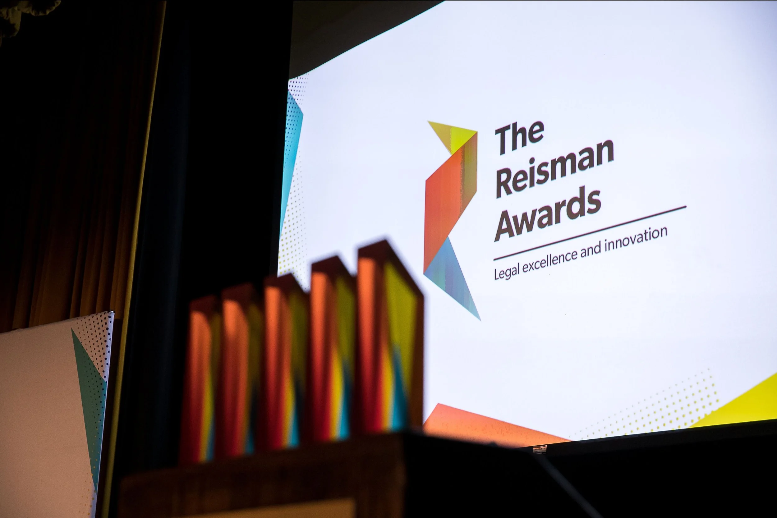
PREVIOUS BRAND: Inconsistent and unrefined
PROCESS & CONSIDERATIONS
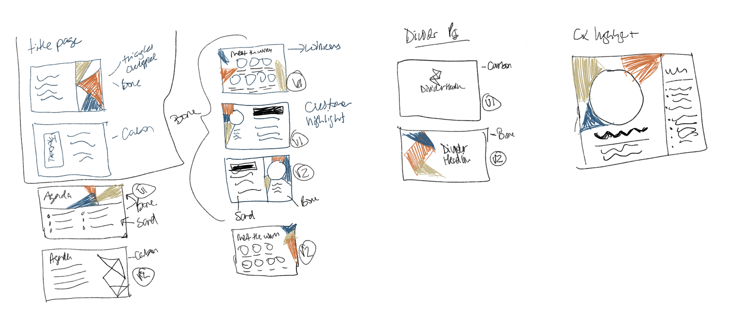
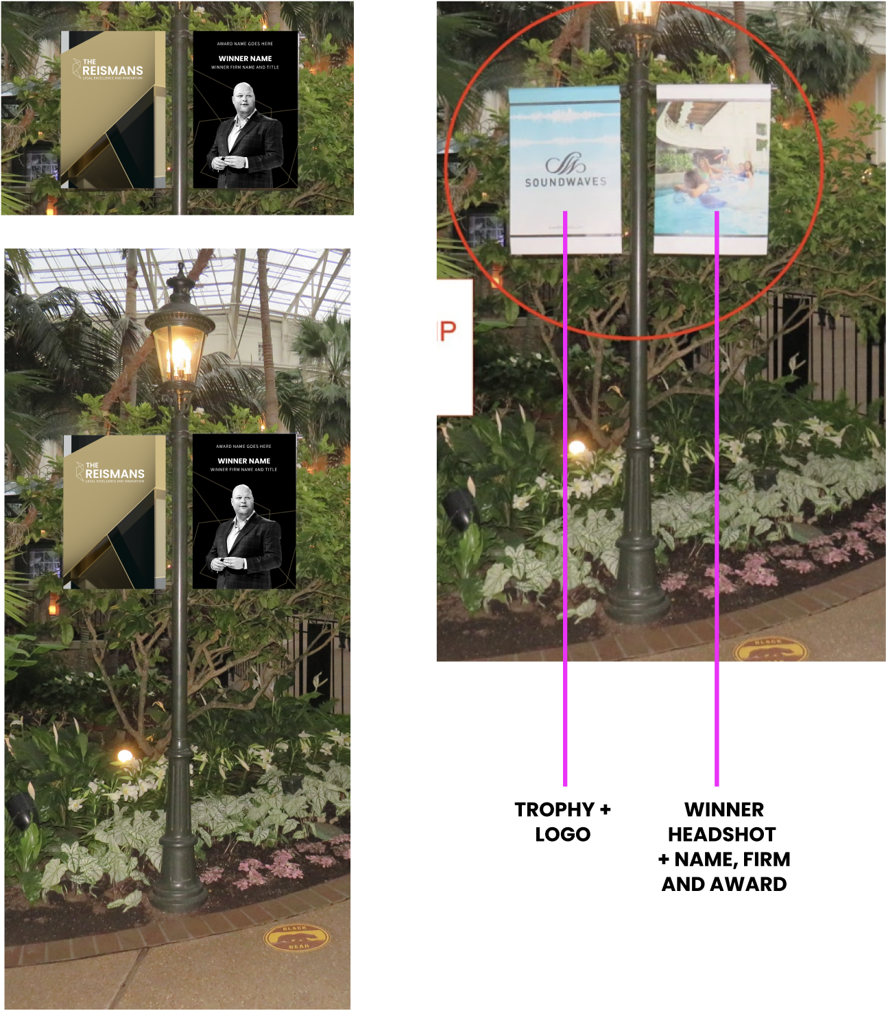
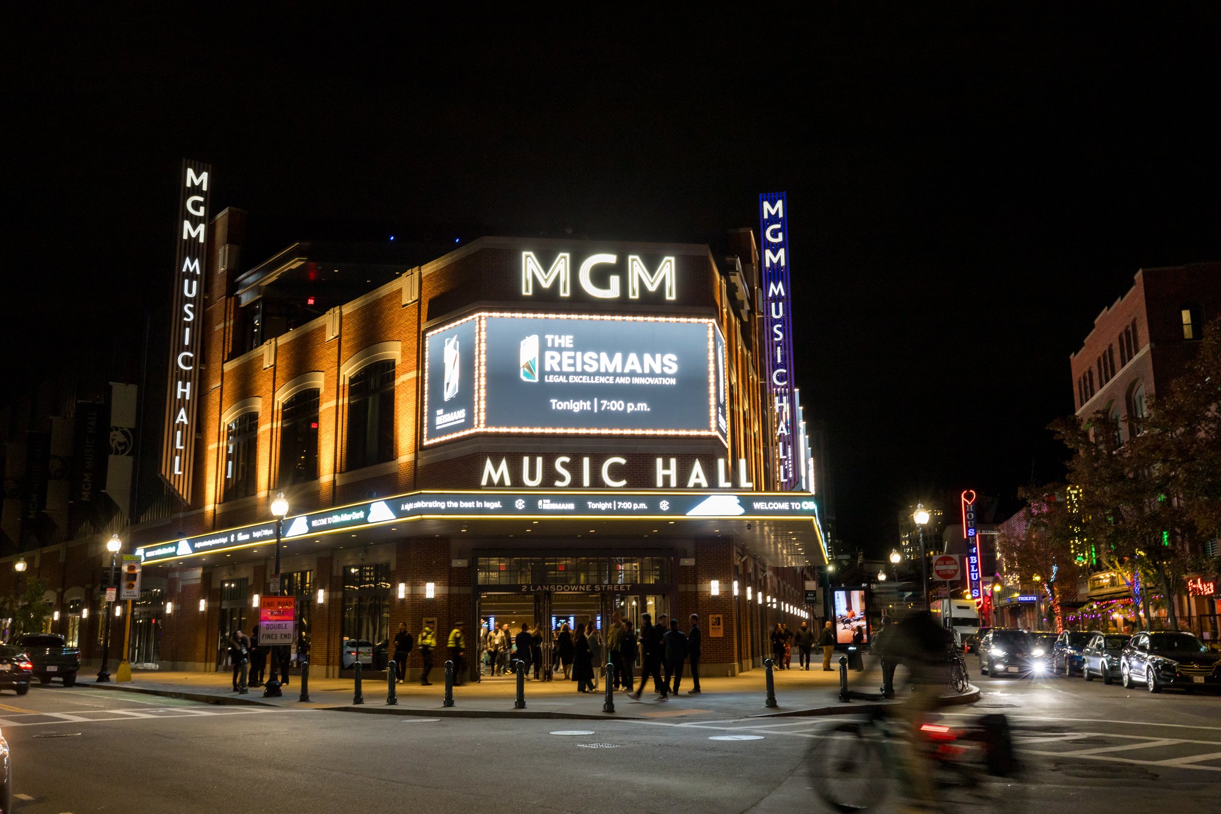
When rebranding the Reisman Awards, I approached the project with a multi-touchpoint mindset, ensuring the new identity worked seamlessly across all applications. This included:
Presentation materials: Google Slides and Keynote decks for nominees, judges, and internal teams.
Print and signage: Banners, posters, and other assets for the annual ClioCon conference, ensuring the brand read as premium in physical environments.
Digital touchpoints: Social media promotions and ads, landing page design, iconography, and video thumbnails, all aligned for a consistent, elevated experience.
Motion & storytelling: Considered how the trophy could animate, developing storyboards in collaboration with a contractor to bring the centerpiece of the brand to life.
Throughout, my insight was to create a system that could flex across formats and scales while maintaining prestige, clarity, and visual cohesion—ensuring that every interaction with the awards felt purposeful and memorable.
To learn more, please enjoy the videos below of two past Reisman Award winners.


OUTCOME: A REFRESHED BRAND IDENTITY
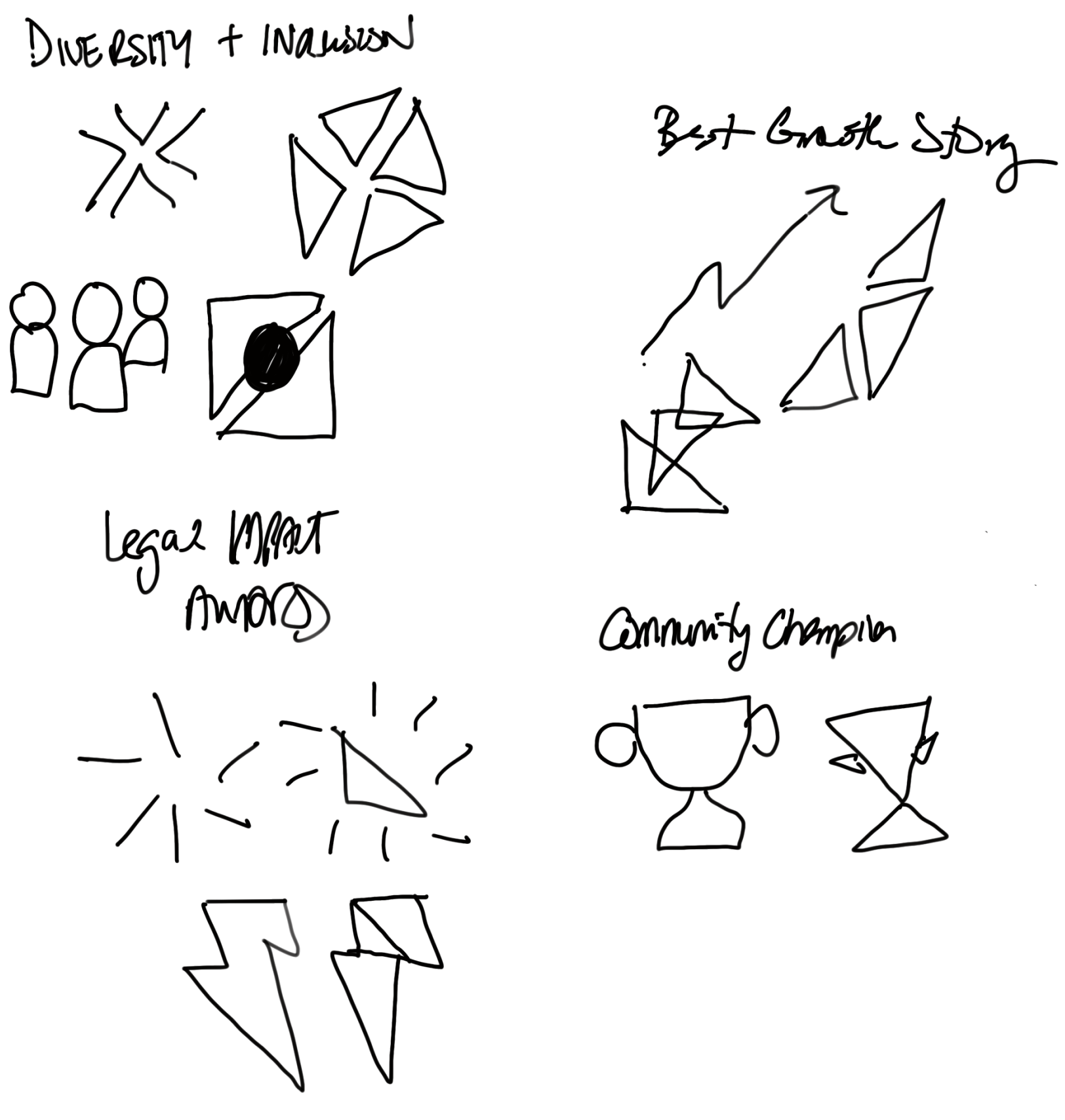
The refreshed Reisman Awards identity elevates the program’s prestige while honoring its history. Overlapping shapes symbolize the union of elements we celebrate—community, innovation, service, and craft—while solo shapes evoke a spotlight, shining on the exceptional work of Clio’s customers. The palette, anchored by “Reisman Gold,” aligns with Clio’s brand while feeling distinct and sophisticated. This rebrand strengthened industry recognition, shifted perception toward a highly regarded, meaningful program, and reinforced Clio’s broader brand ecosystem and storytelling.