

WORK / BRAND IDENTITY / ART DIRECTION
vibeSSENTIALS:
Translating Sound into Space
CLIENT: Jay Glavany
ROLE: Art Director · Brand Designer
DELIVERABLES: Logo System · Packaging · Colour · Guidelines
YEAR: 2025
An identity for a brand that lives between music and space
Jay Glavany is a musician and creative force and vibeSSENTIALS is his sensory product line: candles, fragrances, and objects designed to shape the atmosphere in which music is felt. The core design challenge was to hold two distinct but inseparable identities in one mark: "vibe" (expressive, sonic, cultural) and "essentials" (refined, considered, purposeful). Jay is not only creating music but he is curating the entire environment in which that music exists.
PROBLEM
Balance two opposing brand forces: artistic expression and curated luxury in a single visual identity that doesn't flatten either one.
APPROACH
Resolve the tension typographically. Two typefaces, two weights, two tempos, unified in one mark. Custom details embedded with musical and editorial meaning.
SCOPE
A logo that reads as proprietary and bespoke; an art object as much as a brand mark. The identity positions the brand as culture, not commerce.
OUTCOME
The identity is in active use across packaging, built as a system ready to extend across new product lines, with a clear art-forward positioning established from the ground up.
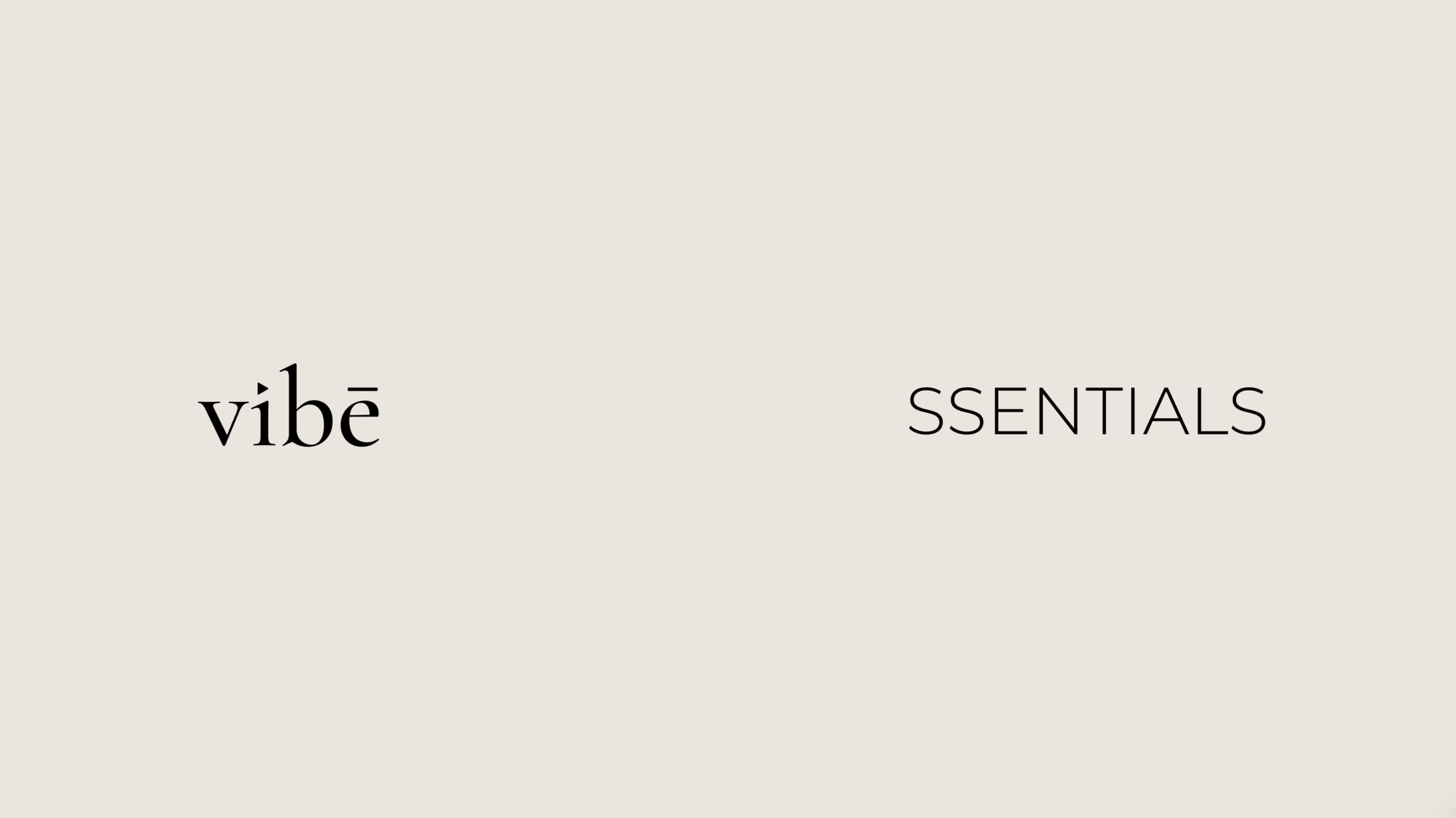
TYPOGRAPHIC APPROACH
The logo isn't a wordmark. It's a score.
The selected serif carries elongated forms and sculptural finesse; the kind of letterform you find in magazine mastheads or poetry anthologies, not always product labels. That elevation is intentional: vibeSSENTIALS is an artform first, product second.
Triangle over the "i" — a directional symbol suggesting play, upward movement, and creative energy. Nods to Jay's musical roots while reinforcing forward motion.
Macron over the "e" — adds a sense of bespoke intention. The mark feels collectible rather than commercial.
Rhythmic Stroke Contrast — the interplay between thick and thin strokes mirrors the dynamics of sound itself: quiet builds and dramatic peaks.
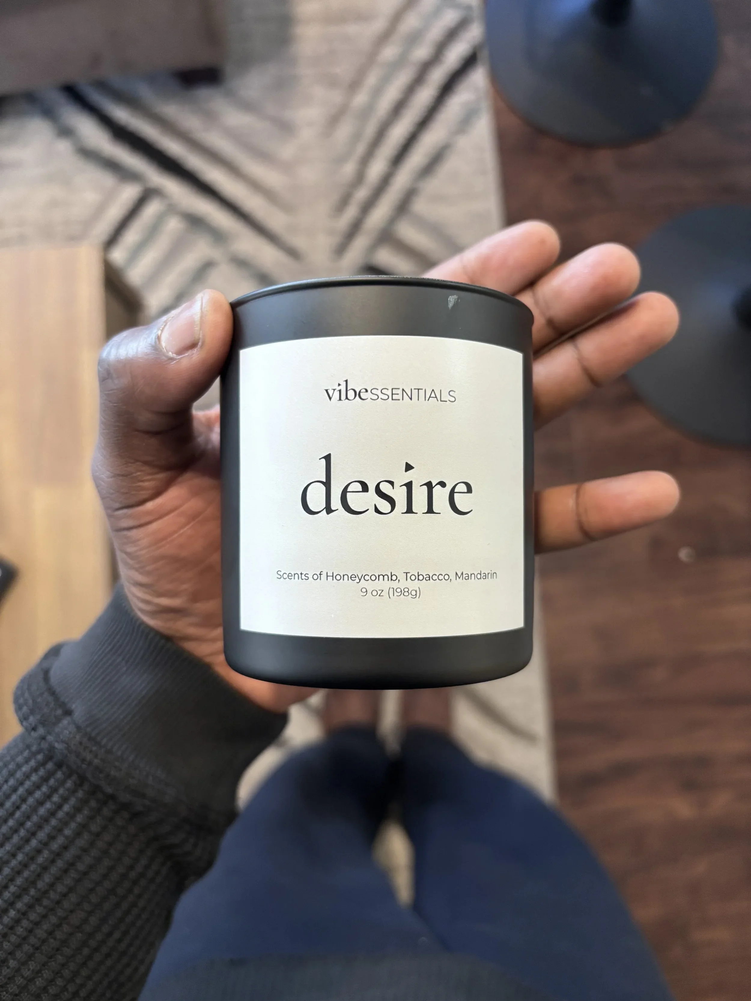
01—THE MARK
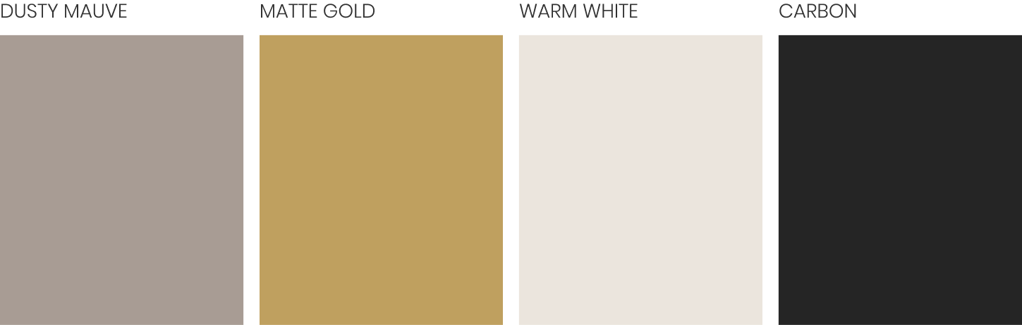
02 — COLOUR SYSTEM
The colour palette was drawn directly from the ingredients at the heart of Jay's candles: tobacco leaf, honeycomb, and honey. Dusty Mauve, Matte Gold, and Warm White weren't chosen for aesthetics alone; they were grounded in the materials themselves. The result is a palette that feels as considered as the products it represents, one that could only belong to this brand.

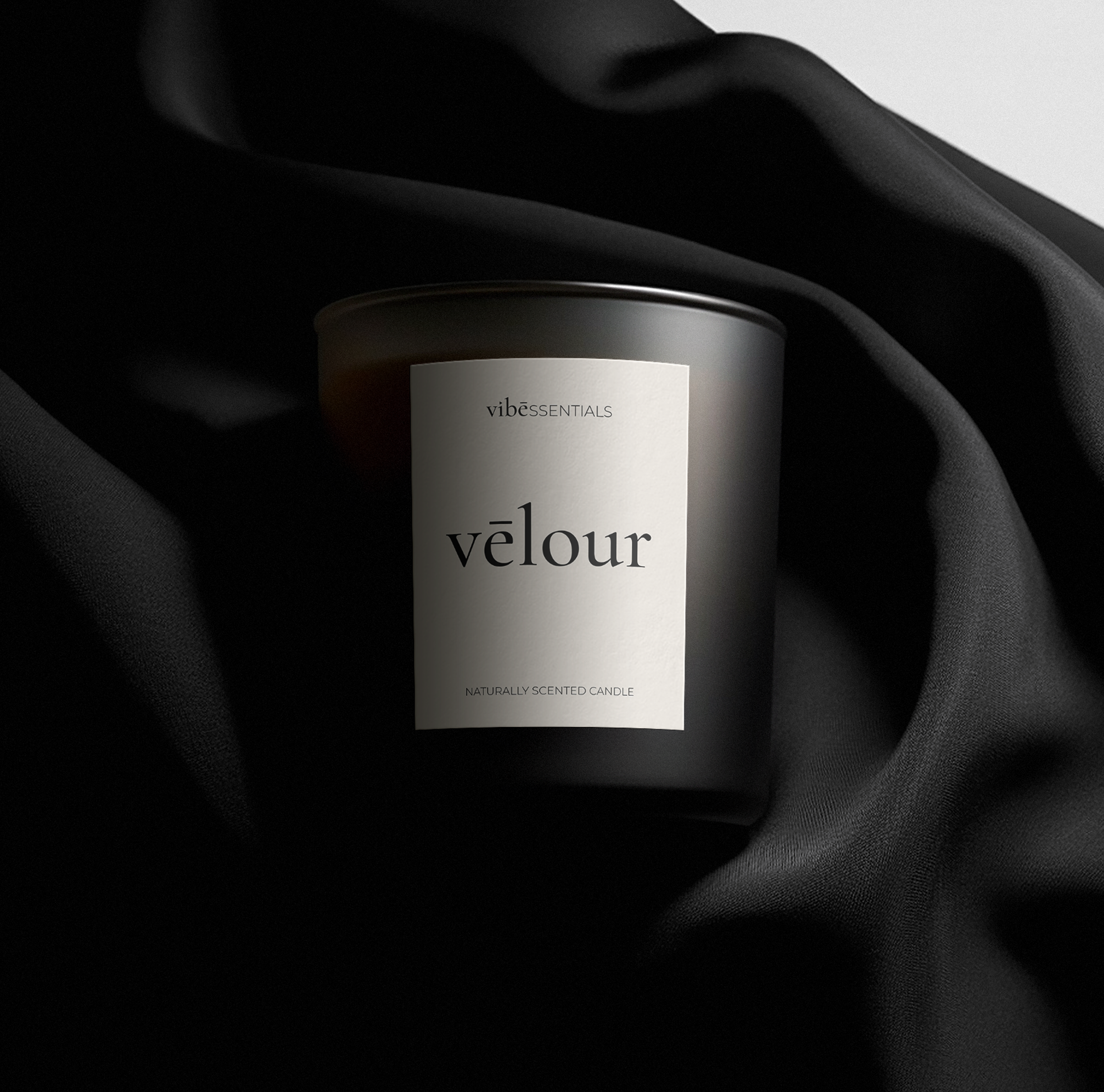
03 — PACKAGING AND APPLICATION
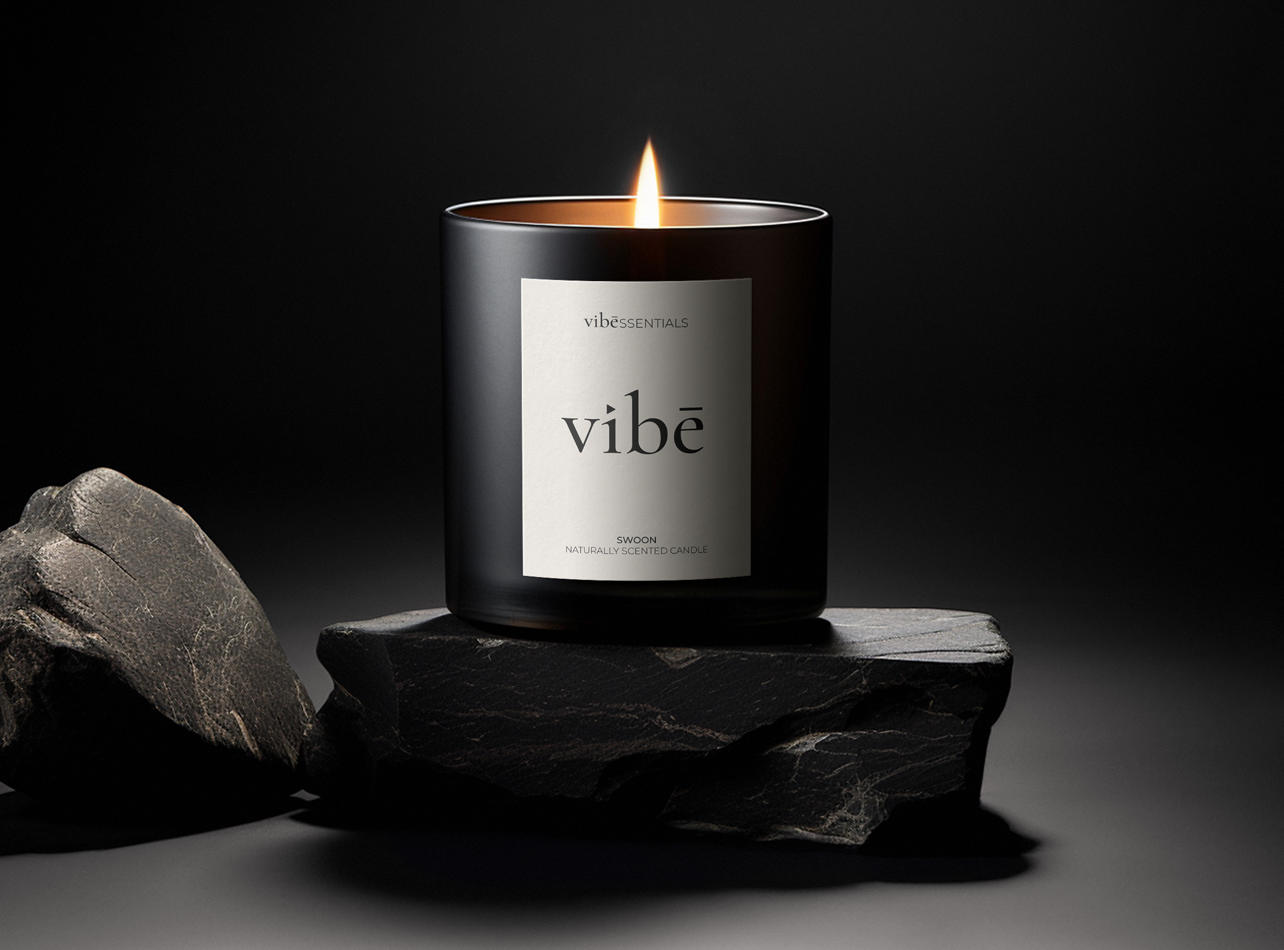
Hear the world the brand was built for.
vibeSSENTIALS exists at the intersection of music and atmosphere. This is Jay's music — the starting point for everything the brand became.