
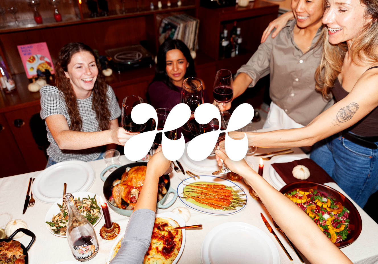
Happy Host: Turning a Founder-Made Brand into a System That Scales
Client: Happy Host
What it is: A brand that helps home cooks plan and host dinner parties with curated menus, timelines, recipes and playlists. It's also growing into a small line of sauces.
Role: Brand refinement and systems design
Deliverables: Wordmark, refined colour and type systems, photography direction and an art-directed shoot, a stock imagery bank, packaging for two products, brand guidelines, social media templates, and a pitch deck.
What I didn't do: Create the original brand. Happy Host's identity was built by Olga Hyunh and her sister-in-law, Darlene Hyunh, before I joined. My job was to take what they'd made and make it ready to grow.
“Emilia was an exceptional partner, always going above and beyond what was needed to build me a brand I can use, scale and grow with”
Olga Hyunh, Founder of Happy Host
The process: A case study
-
The brand wasn't wrong. It was undocumented. Its logic lived in Olga's head, so every Instagram post, label or deck started from scratch, and each one-off choice widened the gap a little. As Happy Host added content, products and partners, that gap would only grow.
So the question I worked from was:
How do I make a brand someone else built feel established, and give its founder the confidence and tools to scale it herself, without losing what made it hers?
-
I want to be clear about where my work starts. I didn't create Happy Host's identity, and redesigning it was never the brief. I came in to refine it, document it and build systems around it.
Three principles guided the work:
Refine, don't redesign. Keep what was already working and recognisable, and fix what was inconsistent.
Let real use guide decisions. A brand that's already in use shows you which colours, fonts and layouts are actually doing the work. I built from that rather than from a blank slate.
Design for the person who'll use it. Olga runs the brand day to day. Every rule needed to be something she could follow without me in the room. Looking back, this is the principle I'd lean on even harder. More on that below.
Olga made the decisions throughout. We worked without a fixed timeline, moving section by section as her priorities came up.
-
1. Refining instead of redesigning
What I gave up: a clean slate, and full control over every visual choice.
What it protected: the recognition Happy Host had already built, Olga's ownership of a brand she and Darlene made, and real evidence of what worked.
A redesign would have been easier to make my own. But it would have reset Olga's audience and asked her to trust a brand she didn't make. Refining kept her as the author and made me the editor.
2. Colour: from 13 swatches to 8 colours with set roles
Instead of inventing a palette, I looked at where Olga was already spending colour and built from the colours doing the most work:
Primary: olive green, the hero colour
Secondary: bright orange and a very dark brown
Accents: light lavender and light blue
Neutrals: cream and a not-quite-black
Call to action: neon yellow-green
The extra reds, oranges and greens, and the yellow, fell away naturally as the palette came together around these.
The neon decision. The bright neon green was one of my favourite things about the original brand, but at full strength it overwhelms everything around it. Rather than cut it, I gave it one narrow job: calls to action and contrasting text on dark backgrounds. The brand keeps its spark, and it shows up only where it helps.
Flexible rules over strict pairings. I set exact values and usage rules, and showed accessible text-and-background pairings so Olga always knows what's legible. I didn't lock her into rigid combinations like "green and white only." A system she'd have to break to get her work done wouldn't be a system for long. The trade-off is that some judgment stays with her, and the guidelines are there to make that judgment easier.
Colour as a product language. The palette also tells products apart. Mama Sauce, the hero "sauce of all sauces," sits in the primary olive. Chilli Oil gets the supporting orange. For moments where Olga wants to feel more premium, like partner outreach, the guidelines show a darker mode with deep backgrounds and a serif.
3. The wordmark: a licensed typeface, chosen for Olga's taste and for small sizes
Olga wanted lettering that was chunky, bold and fun, with personality in the letterforms. I put together several heavy display options and narrowed them with one practical test: does it still read at small sizes? A few of the most characterful options fell apart when small, so they were cut. A wordmark has to work on a jar label and an Instagram avatar, not just a hero banner.
We landed on Swell. It was the closest to her mood board, and it was the one she connected with most.
The trade-off: Olga paid for the license herself, and a licensed font isn't exclusive. In return, the wordmark isn't set in one of the free fonts everyone uses. It feels specific to Happy Host, and it can be installed and reused properly across web, print and packaging.
4. The type system: four fonts, three jobs
The original brand used four typefaces without clear roles. I kept the two that were already doing good work, dropped one, and added a serif for premium moments. Every piece of type now fits one of three roles:
Freitag Display, the voice. Headlines, packaging heroes, campaign moments. All caps, large sizes, short phrases only.
New Spirit, the occasion. A premium serif, used only for curated, high-touch moments and never as the default.
Gibson, the workhorse. Everything else: UI, body, captions and fine print, on a fixed weight ladder (Bold for H1, Semibold for H2, Medium for H3, Regular for body).
One rule ties it together: one voice per piece. Freitag and New Spirit never appear together, so choosing between them signals whether something is everyday or premium.
Each rule in the guidelines comes with a short "why." That was deliberate. If Olga understands the reasoning, she can make good calls in situations the guidelines don't cover.
5. The logo mark we decided not to make
Olga had always imagined Happy Host's logo as an olive. I started exploring, with directions like an olive tree and a cluster of hands coming together to reflect hosting, and put together a mood board.
As the ideas grew more illustrative, I was honest with her: I'm not an illustrator, and if she wanted this done well, it might be worth bringing one in. Talking it through, we reached the same conclusion at about the same time. The monogram she was already using was doing the job a logo mark would do. A new mark wasn't high on her list, and it wasn't what the brand needed most right now.
The trade-off: a less "complete" identity on paper, in exchange for putting time and energy into the things that would change how the brand looked day to day. The door stays open for an illustrated mark later.
I think this was one of the most useful things I did on the project. Being clear about what I can't do well helped my client make a better decision than if I'd pushed ahead.
6. Photography: candid over curated
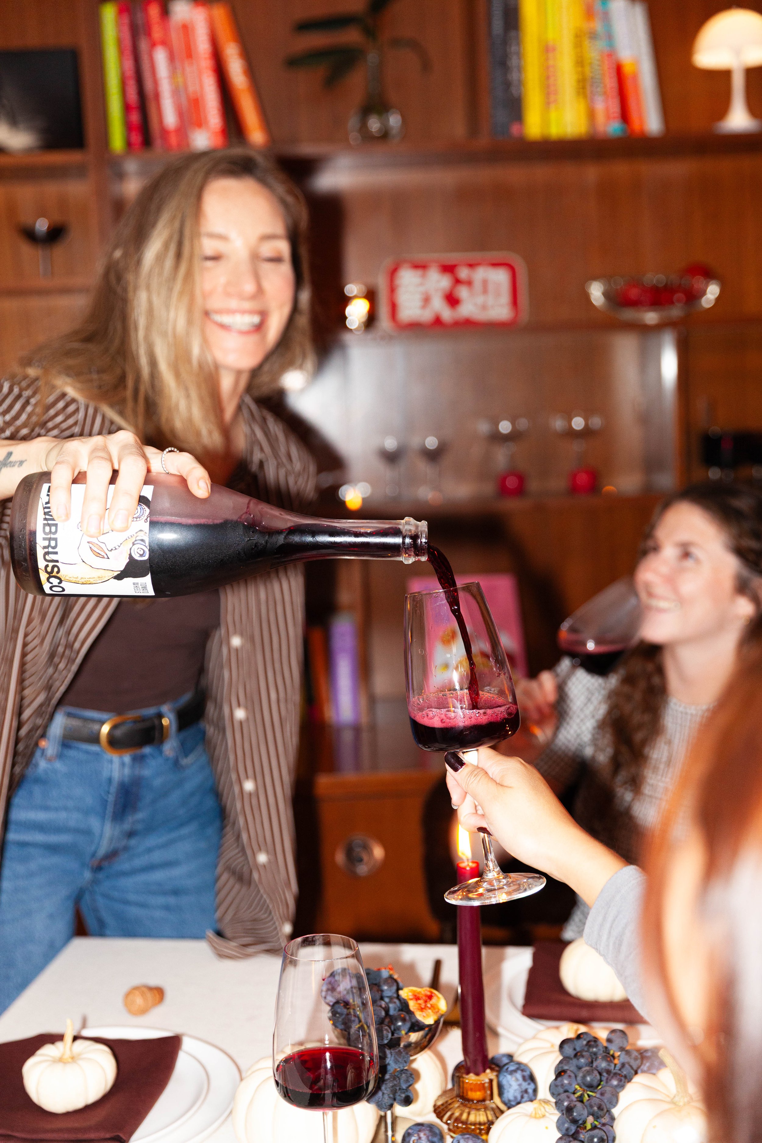
Happy Host is about giving people the confidence to host. The goal isn't a perfect dinner party, just their version of one, and the photography had to feel the same. The guidelines centre on candid flash photography, with room for natural, ambient light. Real moments of connection matter more than styled tablescapes, because connection is what hosting is about.
I art directed and shot a session with Olga and used those photos as reference throughout the guidelines. I also sourced a stock imagery bank and explained why each image fits, so stock never feels like a different brand.
The photography section is written so Olga can send it straight to any photographer she hires, and they'll know what Happy Host needs without a briefing call.
7. Packaging: designing around the product, not just the jar
By the time I designed the labels for Mama Sauce and Chilli Oil, the jars were already bought and filled. That fixed the label size, but it also helped: I could see exactly how each label would sit against the sauce.
Both sauces are a very dark brown. A label in the brand's dark brown would have disappeared into the product, so I went bright, with olive for Mama Sauce and orange for Chilli Oil, and strong contrast so the name reads from across a kitchen.
Practical details mattered as much as looks:
The ingredient list had to stay legible at a small size.
The sticker stock had to stand up to oil. Both products contain oil, and a drip down the side shouldn't leave a label peeling or looking greasy.
The reprint. When the first Mama Sauce labels arrived, the headline felt smaller on the jar than Olga had pictured, and she wanted it bigger and punchier. Making it bigger didn't break any design rules, so we adjusted it and reprinted. Packaging often needs a round of real-world testing, and I'd rather make that adjustment than hold to a proof that doesn't match what the founder had in mind.
-
Refining the brand was half the job. The other half was making sure it held up after I stepped away.
Brand guidelines covering logo and wordmark use, colour, typography, photography, packaging and the stock imagery bank, with the reasoning behind every rule.
Social media templates in Figma. Olga makes her own posts in Figma, so I built the templates there. Each has placeholder text and image frames, so she drops in her copy and photos and publishes. The templates come in several photo layouts across the brand colourways, with safety zones for each format she posts in: feed posts at 1350×1080 and 1440×1080, Reels and Stories.
A reel thumbnail system to fix the scattered look of her Instagram profile, in two families:
Theme-specific thumbnails for reels about a themed dinner, like Thanksgiving, a tomato dinner or a tinned fish board.
Label-specific thumbnails for recipe videos tagged by category: mains, desserts, appetizers and hosting hacks.
On her profile, the grid reads as one brand, and followers can tell at a glance what kind of video they're about to watch.
A pitch deck for investors and small-business partners, built on the same system.
Foundations for what comes next. I'm not building the Happy Host website, but the guidelines are written to guide it, along with future PDF downloadables and other brand assets.
-
Olga now posts with more confidence. Instead of making design decisions every time, she drops her copy and photos into templates built to take the guesswork out. The brand looks like one brand across Instagram, packaging and partner materials, and she has a single source of truth to hand to whoever she works with next, whether that's a photographer, a web developer or a printer.
The brand still belongs to Olga and Darlene. It's just more established now, and ready to scale.